If you’re a student or a professional looking to get ahead, you need a website. It’s your chance to establish an online home base, impress recruiters, and provide something that will set you apart from the stacks of static resumes that everyone else is submitting for job applications.
But creating your own website can be overwhelming. Even if you’ve got the basic technical details down, the possibilities for design, layout, and text are nearly endless.
Because of this, it can be helpful to see some examples of what other people are doing. That way, when you create (or even update) your website, you’ll have some ideas of what to do to ensure that your website doesn’t look (or sound) like it’s from 1995.
That’s why we created this resource. It’s a compilation of 49 of our favorite personal website examples from around the internet. In addition to showcasing the site, each example also includes an explanation of what the example can teach you about creating your own website.
We hope this list gives you the inspiration you need to make your own website. And when you’re ready, you can follow our complete, step-by-step website building tutorial, which will help you get it done quickly and easily.
Let’s get started!
Public Figure Website Examples
To start, let’s look at a selection of websites from public figures. Some are YouTubers and podcasters, others are the CEOs of large companies, and still others are acclaimed novelists. All of them, however, have excellent websites that have a lot to teach us about website creation.
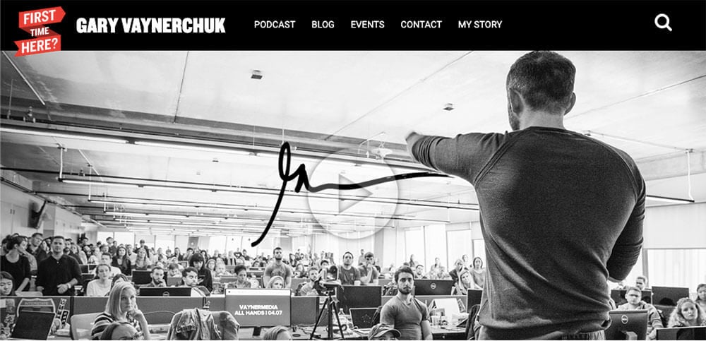
Gary Vaynerchuk is a serial entrepreneur, podcaster, and CEO of the full-service digital agency VaynerMedia. He’s bold and in-your-face, and his site reflects that. To get a sense of his style, check out Thomas’s interview with him way back in the day on Episode 8 of the College Info Geek Podcast (was that really almost 5 years ago???). Here’s what you can learn:
- Featured video – There’s not doubt that Gary is in-charge, based on the video of him addressing his entire company in his authoritative, inspiring style. If you have an awesome video that shows off your accomplishments, then featuring it on the front page of your site can be a great way to stand out (though make sure it’s not a crappy phone video — that just undermines your credibility).
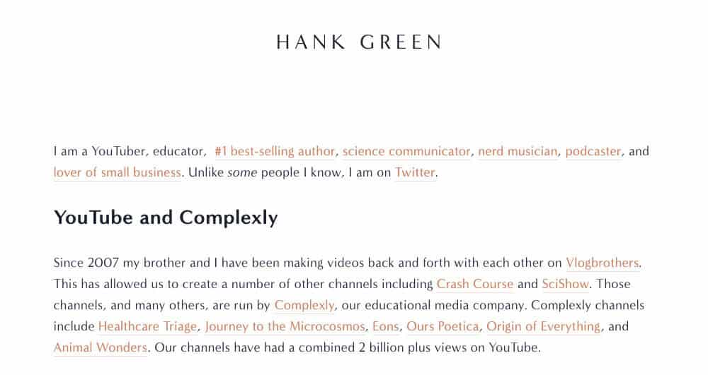
Hank Green is something of an internet celebrity, as well as the co-founder of a lot of projects. Thomas even collaborated with him to produce a primer on study skills for the Crash Course series. Here’s what you can learn from his website:
- Project showcase with personality – Hank has done a lot of different things, and the homepage of his website shows them off with minimalism and a bit of humor. It’s a great example of how your personal website can serve as a “home base” for your various projects.
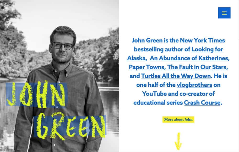
The other half of the Vlogbrothers, John Green is best-known for his bestselling novels, though he also collaborates with Hank on projects such as Crash Course and VidCon. This is what you can take away from his site:
- Compact project showcase – In one paragraph, John gives you everything you need to know about his major accomplishments. He includes links to his books, and then follows with links to his most acclaimed online projects. There’s also a link to learn more if you’re so inclined. This kind of summary is super helpful to include on your website, even if you’re not (yet) as accomplished as John. Give a concise summary; don’t overwhelm visitors with your life story right off the bat.
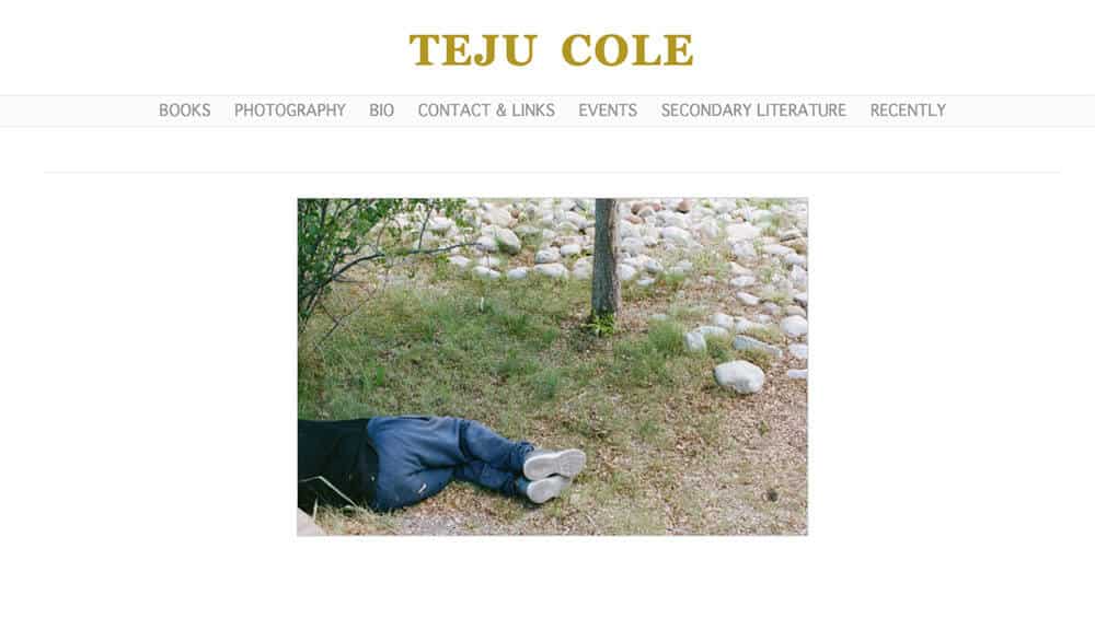
Teju Cole is one of my favorite contemporary authors, so I had to include his website, especially after I saw its clean design. Cole’s site is an instructive contrast to John Green’s. Both are authors, but in very different areas; their site designs reflect that. Here’s what you can learn from Cole’s site:
- Showcasing a variety of work – Cole is best known for his novels, but he’s also a photographer and frequent contributor to magazines such as The Atlantic. His site showcases this variety of work, using one of his photos on the homepage along with links to the other things he’s up to.
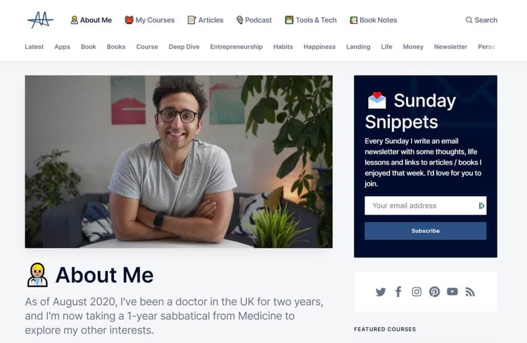
Ali Abdaal is a doctor in the U.K. who also makes YouTube videos and podcasts about productivity, academics, and personal development. Ali’s site has a clean, simple design that utilizes emoji in a style quite reminiscent of Notion. Here’s one of the main takeaways from his site:
- Content-Rich: Ali makes it easy to find information about who he is and what he does, but his site is also chock-full of content. He creates posts for each podcast episode, and regularly writes blog posts as well. He even publishes his book notes. This focus on content perfectly complements his personal brand, and leads to more potential entry points for his site.
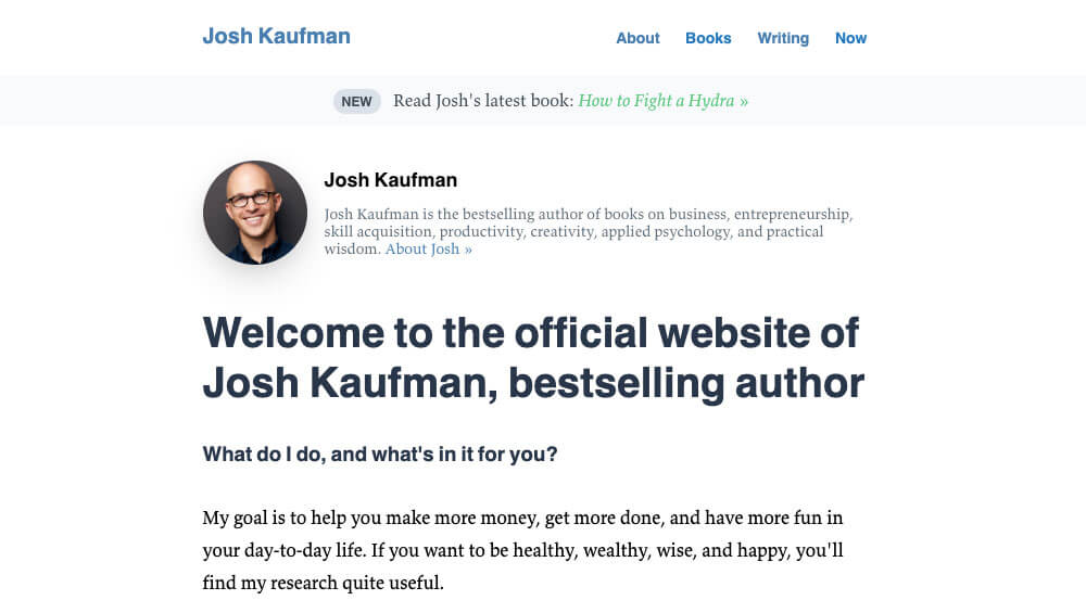
Josh Kaufman is an author who writes about business, productivity, and skill acquisition (among other things). He’s best-known for The Personal MBA, a book that distills the principles of business into terms anyone can understand. Here’s what his site can teach you:
- Explaining how he can help you – With 3 published books under his belt, Josh could simply say “this is what I’ve done.” But he doesn’t get complacent. He not only describes what he does, but also “what’s in it for you.” This shows a commitment to serving his site visitors, which builds trust.
Solo Professional Website Examples
Up next, we have a roundup of some solo professional websites. Some of them are online freelancers, while others own brick and mortar businesses. This may not be the sort of site you need as a student, but you won’t be in college forever (that would mean we’re failing at our job). If you decide to work for yourself, these are the sorts of sites you’d want to create.
And even if you take a full-time job, you can still learn a lot about personal branding from the way these folks have set up their sites.
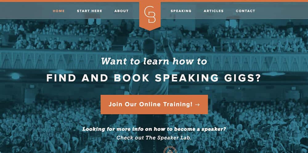
Grant Baldwin is a seasoned professional speaker, and he’s taken that experience to create online trainings for others who want to learn how to speak in public or improve their existing speaking businesses. To learn more about how Grant got started speaking, check out Thomas’s interview with him in Episode 22 of the College Info Geek Podcast.
Here’s what you can take away from his website:
- Clear navigation – One challenge for solo professionals is how to promote a variety of services without overwhelming site visitors. Grant handles this well on his homepage, promoting his current offer for experienced professional speakers while also giving a link for people who are interested in learning how to get started speaking for the first time.
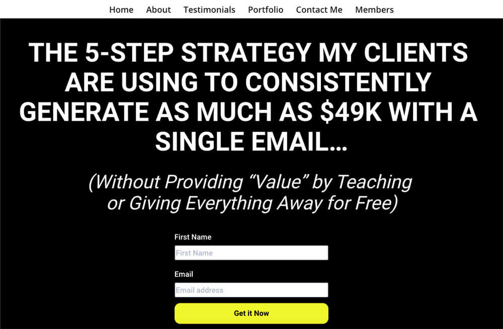
Rebecca Parson is a freelance copywriter. Her website has a lot to teach anyone looking to build a website to sell their services:
- Clear call to action – Right when you land on her site, Rebecca presents you with a compelling offer. She clearly knows her target audience and doesn’t waste your time. If you want what she’s offering, you’re likely to subscribe. If you’re attempting to gain email subscribers (and have something valuable to offer them), this is the design to emulate.
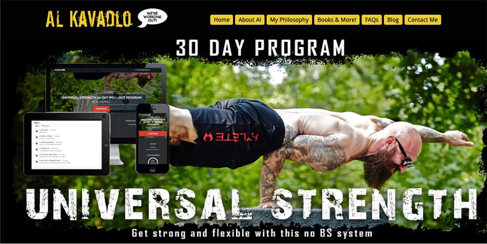
All Kavadlo is best known for his in-person workshops and YouTube videos of gravity-defying calisthenics and gymnastics. Still, he doesn’t neglect the value that comes from having a personal website, particularly to promote his strength and flexibility course.
Here’s what Al’s site can teach you:
- Branding with personality – Al isn’t a conventional guy, and his site design reflects that. He uses a black and yellow color scheme reminiscent of caution tape and a gritty font to show off his personality.
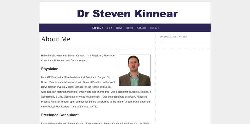
Dr. Steven Kinnear’s site is one that Thomas created back when he was a freelance web designer. Dr. Kinnear is a physician, but he’s also so much more, as his site shows. Here’s what his site can teach you:
- Unconventional branding – Among other things, Dr. Kinnear describes himself as a “doctorpreneur”. This invented word is both intriguing and descriptive of Dr. Kinnear’s unconventional professional pursuits, in which he combines his medical knowledge with other business ventures.
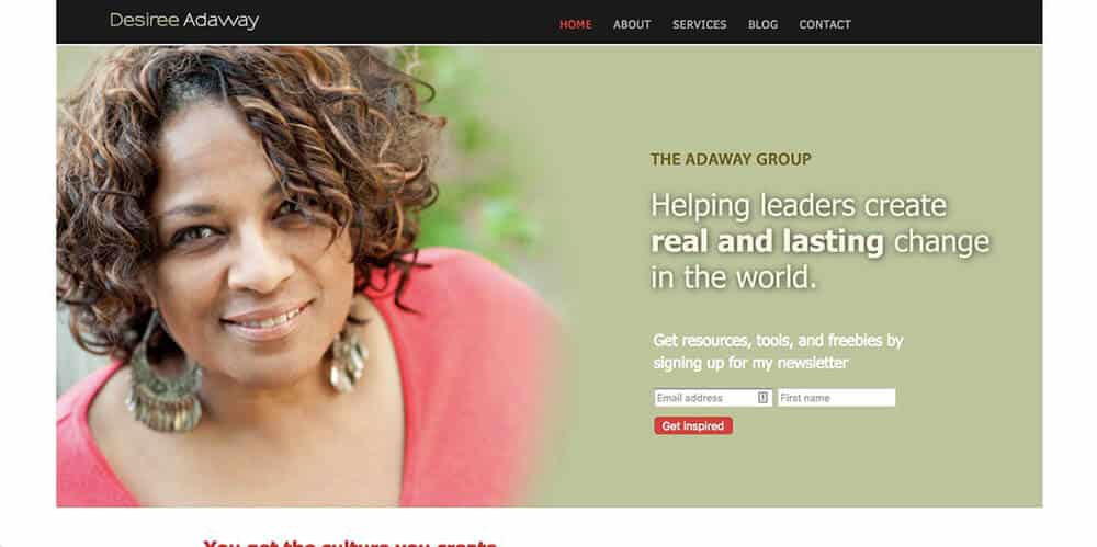
Desiree Adaway consults with organizations to help them build resilient, equitable, and inclusive cultures. Here’s what you can learn from her site:
- Prominent photo – Desiree has chosen a photo that projects authority while still being approachable.
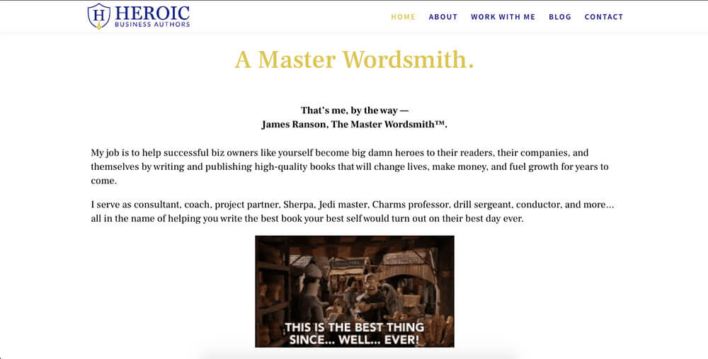
If you’re a long-time reader of College Info Geek, then James’s name may be familiar. Thomas interviewed him way back in 2014 on Episode 41 of the College Info Geek Podcast. Today, James is an author, book coach, and founder of Heroic Business Authors (as well as a friend of mine).
What you can learn from the site:
- Branding – With the trademarked phrase “The Master Wordsmith”, James shows that his work is of the utmost quality. He’s not just a “professional” or an “expert” — he’s a “master”. But at the same time, the GIFs and description of himself as a “Charms professor” show that he doesn’t take himself too seriously.
Student Website Examples
You may think that you don’t need a website as a student; isn’t a LinkedIn profile enough? This couldn’t be further from the truth. If you’re a student, you absolutely need a website. To show you that it’s possible, here are some inspiring website examples taken from CIG reader submissions:
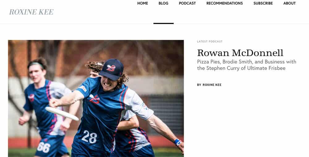
A former writer for College Info Geek, Roxine took our advice to heart and created a personal blog/website. Here’s what you can take away from Roxine’s site:
- Featuring your latest work – Roxine’s latest venture is a podcast called The Creator Maker Life. Her site’s homepage prominently features the show’s latest episode. If you have a new/ongoing project you want to promote, this is a good tactic to use.
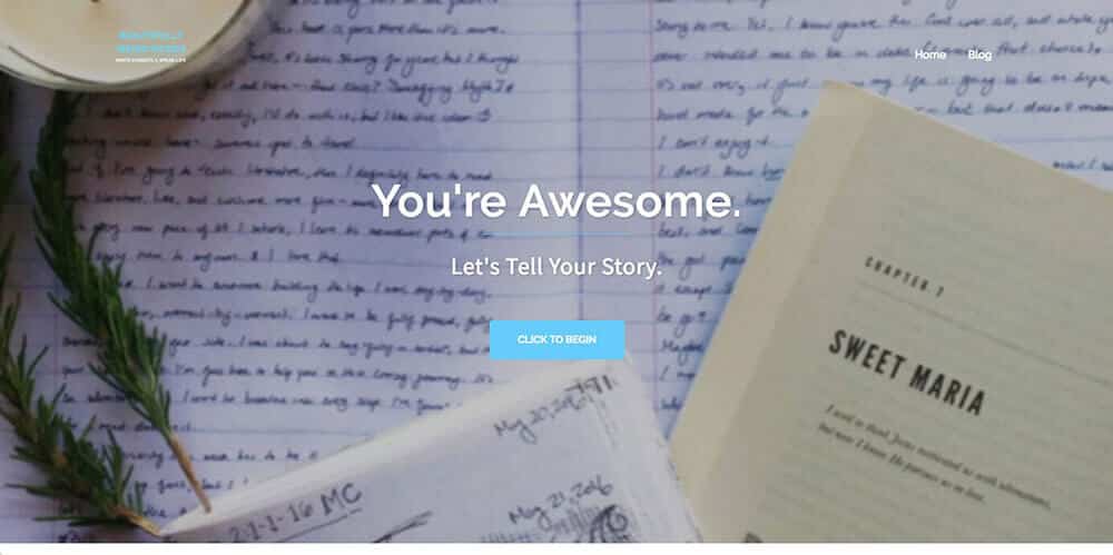
A former writer for College Info Geek, Elizabeth is a great freelance writer with a website to showcase her work and tell her story. Here’s what her site can teach you:
- Affirmative, inviting homepage – Who doesn’t want to be told, “You’re Awesome.”? This statement invites readers in, and then “Let’s Tell Your Story” leads into the services that Elizabeth offers. You can do the same whether you’re offering freelance services or just want to direct visitors to your portfolio.
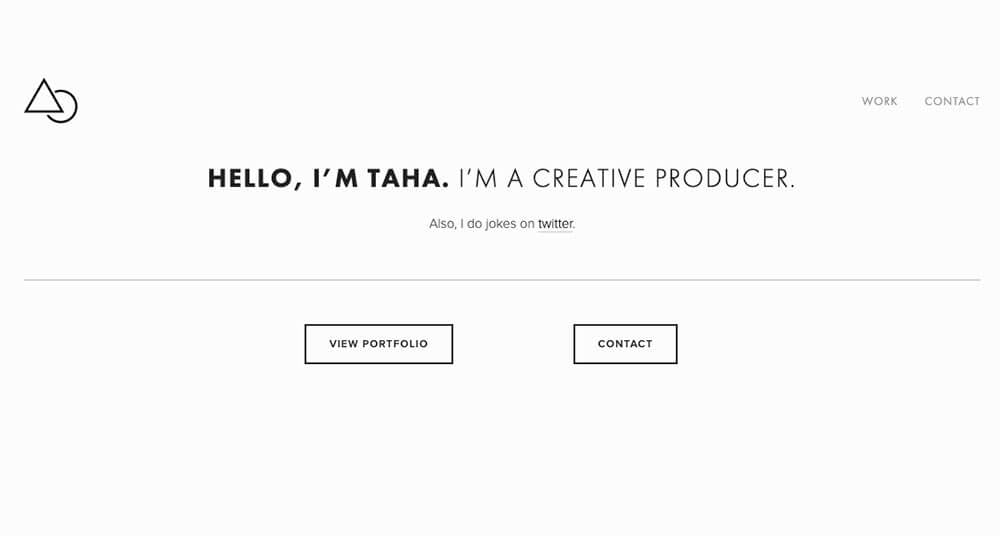
Taha Khan does a lot of different things, including speaking, directing, comedy, and film production. Here’s what you can learn from his site:
- Clean site design – Since I first put together this guide, Taha has updated his site design to be very clean and minimal. The homepage features just three links: his Twitter, his portfolio, and his contact information. It’s a great example of how to create a site that showcases the essentials without overwhelming visitors.
Personal Branding Website Examples
I’ve already touched on personal branding a bit in this post, but next up I want to look at some websites that are killing it with how they showcase the site owner’s personality and style.
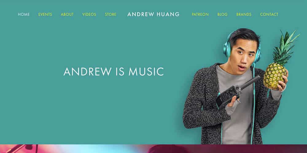
Andrew Huang is a musician, producer, and YouTuber. I’ve been following his YouTube channel longer (and more consistently) than any other (except for the CIG YouTube channel, of course). His videos are creative, funny, and always impressive. Here’s what his site can teach us:
- Unique photo – The site tagline informs us that “Andrew is music”, but the photo says so much more. Andrew is also creative, stylish, and unconventional. Most of us won’t be able to get a photo like this (and it wouldn’t be appropriate for most of us, anyway). But it’s a lesson in how you can use photos on your website to showcase your personality, whatever that might be.
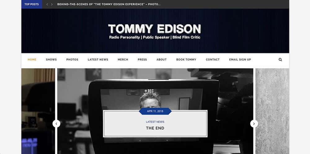
The self-proclaimed “Blind Film Critic”, Tommy Edison runs another of my favorite YouTube channels: The Tommy Edison Experience. On this channel, he answers questions about what it’s like to have been blind since birth, all with his signature blend of humor and wit. Here’s what his site can teach us about branding:
- Innovative brand – “Blind Film Critic” has to be one of my favorite branding statements on the internet. It defies expectations, taking two things that most people would never put in the same sentence to create a brand (and YouTube series) that’s totally unique.
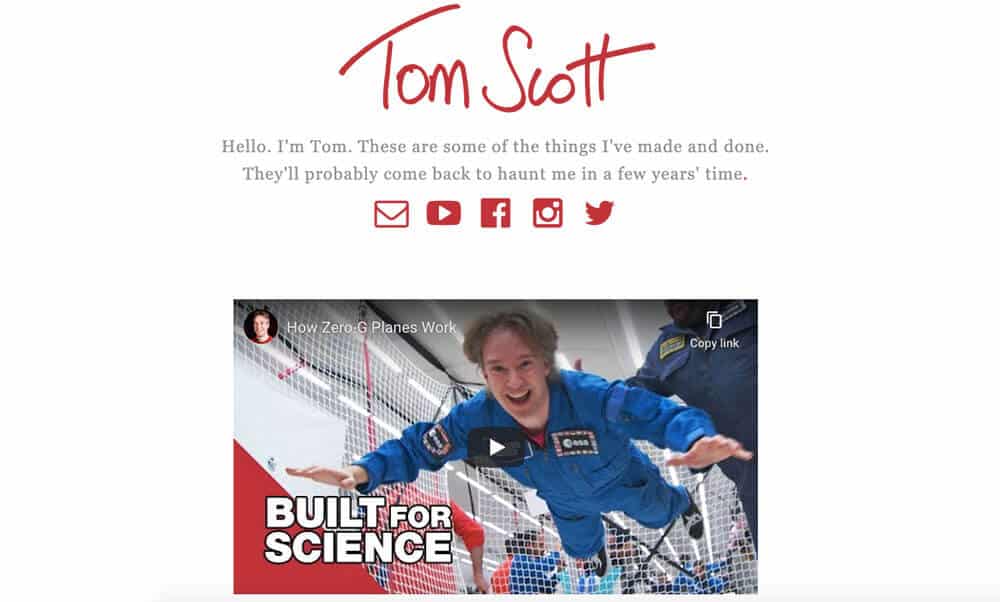
Another of my favorite YouTubers, Tom Scott runs a channel where he explores amazing places, things you might not know, and more (his channel is kind of hard to explain but really fun to watch).
Here’s what you can learn from Tom’s site:
- Self-deprecating humor – If used correctly, a bit of self-deprecation can make your site more approachable. Tom does this perfectly, slipping in the phrase “They’ll probably come back to haunt me in a few years’ time” before linking to his YouTube channel, social media, and contact email. Be careful, though, as this type of humor can come off as a lack of self-confidence if you do it incorrectly.
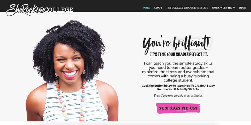
We love to showcase the work of other people who are helping students succeed in college, and Clarissa Rodriguez is one of those people. She offers an online course on study skills, as well as personalized study consultations. You can learn more about her inspiring story of going from failing multiple classes to graduating college with honors in Episode 68 of the College Info Geek Podcast.
Looking at her site, you can also learn some important lessons about personal branding:
- Clever site name – Clarissa has chosen a great name (and logo) for her site. Instead of just writing “She Rocks at College,” she chose to stylize the name as SheRocks@College. The use of the “@” symbol is a great way to differentiate her brand name while appealing to her college student audience.
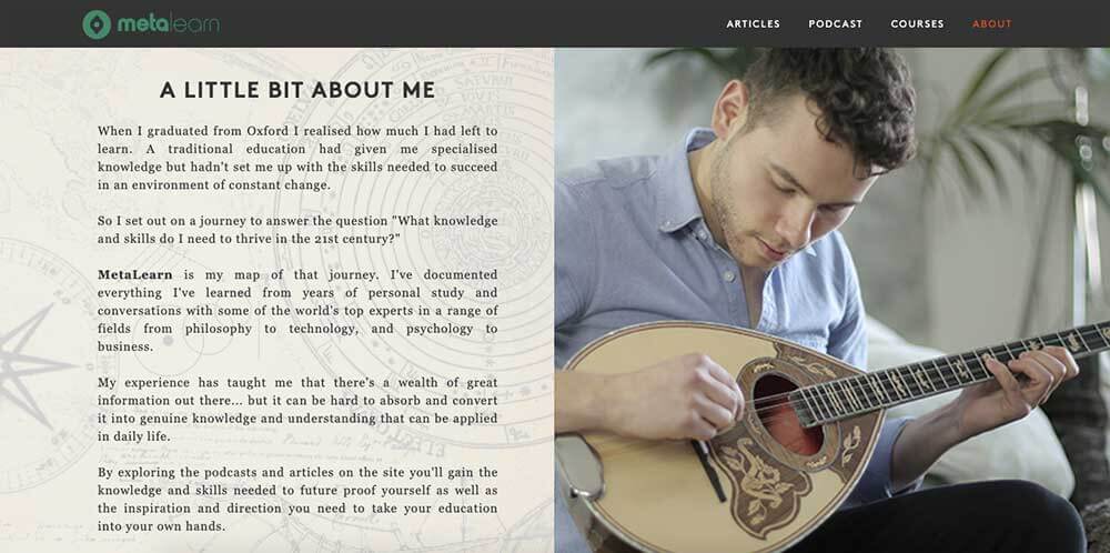
Nasos Papadopoulos is the founder of MetaLearn, of method and series of courses that teaches you how to learn things on your own. The site also has superb branding:
- Inviting, relevant photo – Nasos has chosen a perfect photo for his About page. It shows him playing an instrument, a skill that fits perfectly into his message of being a lifelong learner.
In addition to writing and editing blog posts for this site, I also work on SEO (Search Engine Optimization). Briefly, it’s the field of getting your website to show up as high as possible in Google search results (or technically other search engines, but in practice that tends to be Google as its the dominant player).
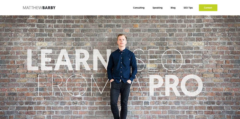
Matthew Barby’s site has been my main guide as I’ve been teaching myself SEO. Additionally, the site is a masterpiece of personal branding:
- Compelling tagline – This site could easily have gone into the “Design” section for the way it blends text with a large featured image, but the main takeaway for me is how it emphasizes Matthew’s pro status. “Learn SEO from a Pro” is exactly what I and anyone else who wants to learn SEO want to see (who would want to learn SEO from an amateur?). And it’s all the more effective because he backs up the claim with massive SEO tutorials and case studies that demonstrate just what a professional he is.
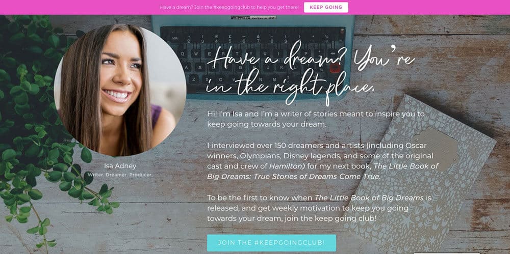
Isa Adney is a writer and webinar producer for ConvertKit, as well as author of the forthcoming The Little Book of Big Dreams: True Stories of Dreams Come True. She appeared in Episode 46 of the College Info Geek Podcast, where she discussed how to make community college an ivy league experience. Here’s what her site can teach you about branding:
- Highlight your current work – The front page of Isa’s site gives a preview of the book she’s currently working on, which is based on interviews with Oscar winners, Olympians, Disney legends, and some of the original cast and crew of Hamilton. Make sure to keep your site updated to reflect your current work. That way, people who land on your site won’t have an outdated impression.

Tasha Meys is an artist, photographer, social media consultant, and world traveler. Her site showcases all of this work with a brand that is colorful and exciting. Here’s what her site can teach you about branding:
- Clever website and brand name – “Tastefully Tash” has to be one of the best personal brand names I’ve ever heard. The alliteration makes it fun to say, while the adjective “tastefully” hints at the artistic taste she applies to her professional work.

At College Info Geek, one of our main goals is to show you that you can go to an excellent college and have a great experience without taking on student loans. Shanice Miller’s story shows you that you can do just that; she earned so many scholarships that she actually got paid $10,000 to attend college.
You can learn more about her story in Episode 34 of the College Info Geek Podcast, and you can also learn a lot from her site about personal branding:
- Authoritative logo – My favorite part of Shanice’s site is the logo at the top, featuring a bold “Debt Free” stamp. A good logo goes a long way, provided you can get one that’s well-designed.
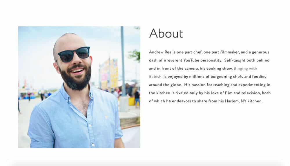
Andrew Rea is a chef, filmmaker, and creator of the popular YouTube cooking show Binging With Babish. While he rarely uses his real name in his YouTube videos, I love the About page on his website. Here’s what his website can teach you about personal branding:
- Clever website bio – Andrew’s bio describes him as “one part chef, one part filmmaker, and a generous dash of irreverent YouTube personality.” Written as a recipe, this description fits right in with Andrew’s cooking show brand. The photo is also perfect, showing someone who’s fun, casual, and cool.
Website Design Examples
Next, we move to the design portion of this guide. Many of these sites showcase the work of graphic, product, or UX designers; unsurprisingly, they are well-designed. But others showcase the work of authors, photographers, and thought leaders, showing that you don’t have to be a designer to have a compelling site design. All of them serve as an inspiration.
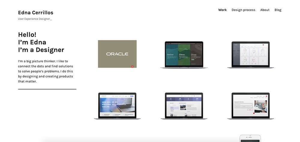
As you can clearly see from the first glance, Edna Cerrillos is a designer (a product and UX/UI designer to be more precise). As you would expect from a designer’s personal website, Edna’s site can teach us some important design lessons:
- Image links – I love the way the featured images link to items in Edna’s portfolio. If you click on the image, it directs you to a more detailed project case study. This is an excellent strategy for cleanly featuring a variety of portfolio work on one page.
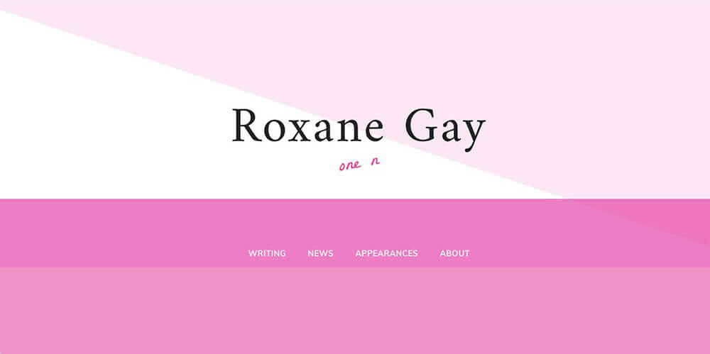
Roxane Gay is an author, essayist, and speaker. She’s one of my (other) favorite contemporary authors, so I was delighted to see that her site is also an excellent example of design:
- Minimalism with personality – The image you see above is exactly what appears when you visit Roxane’s site. There are no additional menus or text–just the one footer menu with links to everything a visitor would want to know, all backed by a pleasing geometric design. The “one n” is also a nice branding touch.
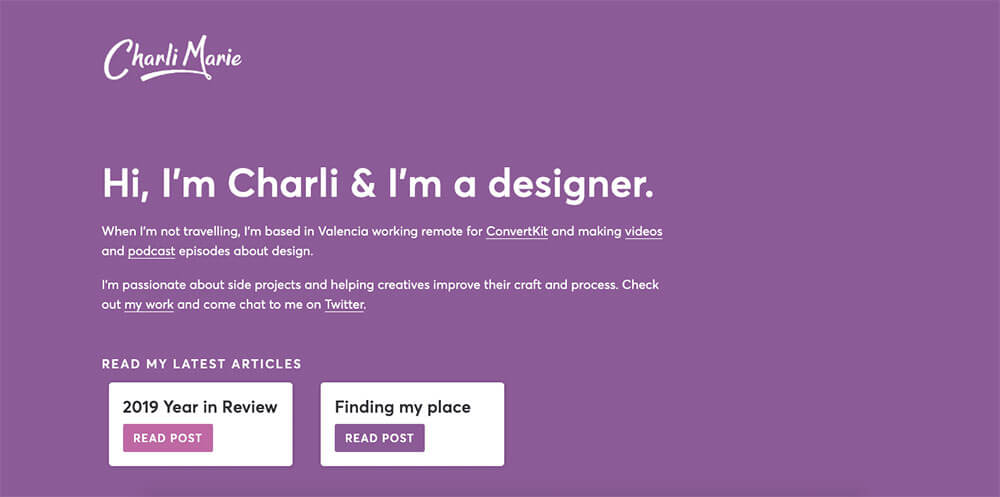
Charli Marie is a designer, speaker, and self-proclaimed “side project addict” who currently works for email marketing software company ConvertKit. The site is a design masterpiece:
- Tasteful animation – When you first load the site, Charli’s name appears with a “writing” animation. Animation is difficult to do well in site design, but Charli pulls it off. If you have the skills to add such design flourishes to your site without slowing it down, then give it a shot. But use caution.
Want to start your own side project? Here’s how.
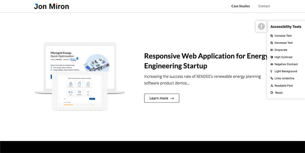
Jon Miron is a designer and product engineer. Here are some design lessons to take away from his website:
- Built-in accessibility tools – Accessibility is an often-overlooked (but extremely important!) part of web design. Jon takes the initiative by building an accessibility tools menu right into his website. Not only does this make his website easier to use, but it also shows potential clients/employers that Jon brings a commitment to accessibility to all his projects.
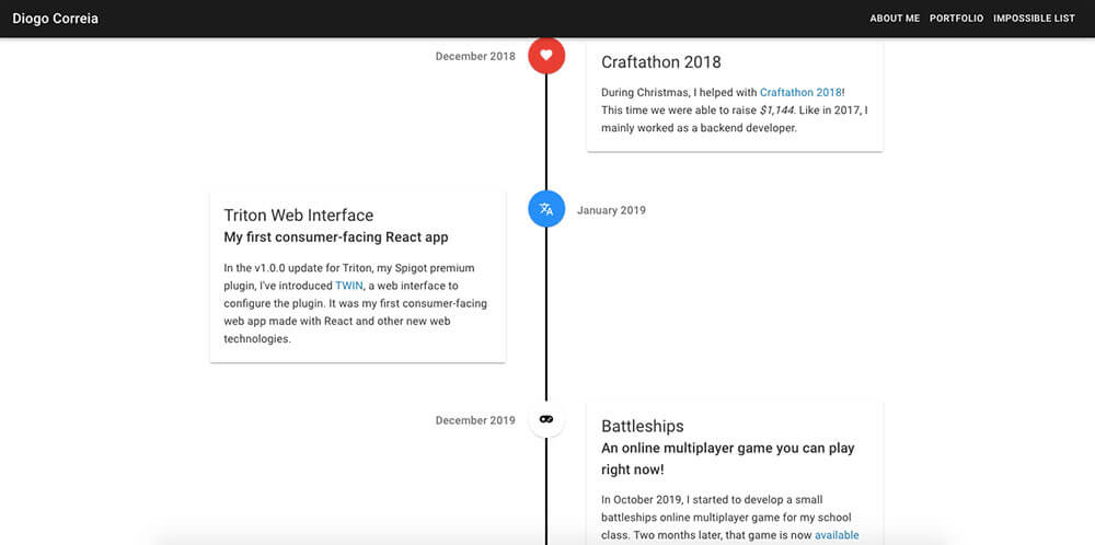
Diogo Correia is a student, developer, and runner. But what most caught my eye about his site was its design:
- Unconventional portfolio design – I love how Diogo uses a timeline in place of a traditional portfolio page. Touches like this can really set you apart in the eyes of recruiters who spend most of their days slogging through boring resumes or cookie-cutter website designs.
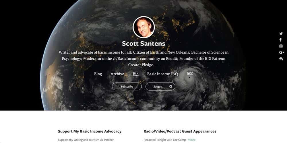
Scott Santens is a writer and basic income advocate. But he also has a well-designed website to serve as an online home base for his writing and advocacy. Here are my favorite parts of the design:
- Concise design and navigation – Scott has links to all his different projects right within the main page of his site. He also has an easily accessible “Search” bar to make the site even easier to navigate.
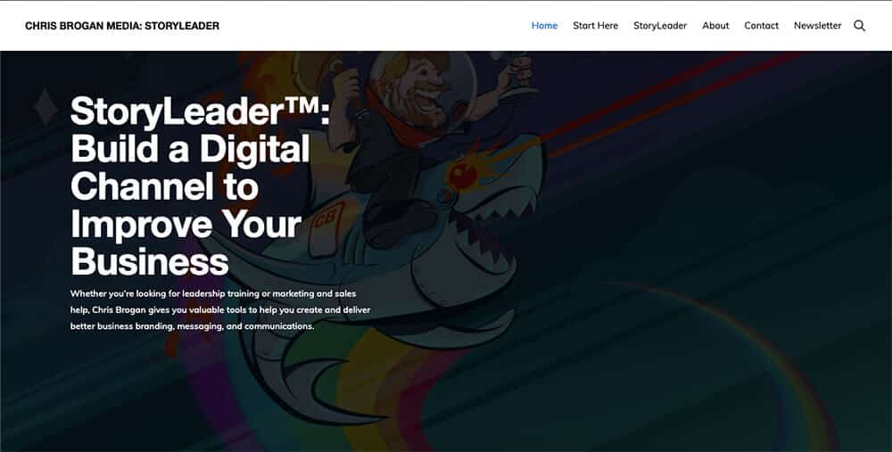
Chris Brogan is a speaker, NYT bestselling author, and business storytelling consultant. The design of his website also has a lot to teach us:
- Unique background image – How many consultants and professional speakers have websites with an illustration of themselves riding a robotic shark shooting lasers out of its eyes? The creativity of this image demonstrates the creativity Chris brings to his consulting work, assuring clients that he isn’t just another boring business consultant.
Website Copy Examples
In marketing and advertising, “copy” refers to the words you use to get your message across. The following sites use especially effective copy, whether they’re promoting services or just giving you an overview of the creator’s projects.
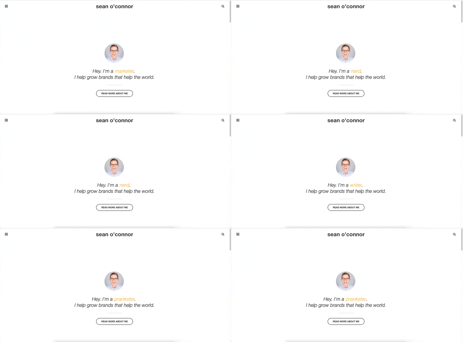
Sean O’Connor is…well, many things, and his site reflects that. I could have put it in the “Design” section, but I think it’s an even better lesson in effective site copy:
- Concise and memorable – “I help grow brands that help the world” is a concise statement of purpose that sticks with you. Distilling what you do into such a compact format is no easy task, but it’s a powerful tool for marketing yourself. How would you describe what you do in once sentences?
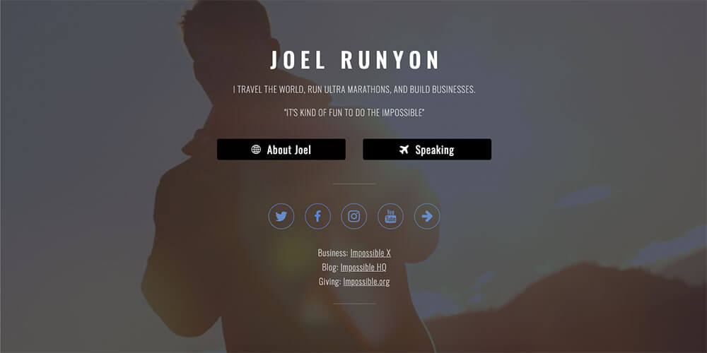
Joel Runyon is a world traveler, ultra marathon runner, and business founder. Thomas interviewed him back in Episode 43 of the College Info Geek Podcast after learning about his Impossible List concept (an improved version of the classic “bucket list” that I’ve also incorporated into my website).
Here’s what you can learn from Joel about writing website copy:
- Pick 3 things – Summing yourself up in a few words is a challenge, and you certainly do more than one thing. But if you have a giant bullet list of 15 different projects or skills, it can be overwhelming to site visitors. Joel’s site showcase a tactic you can use when writing a summary of what you do: pick 3 things. Joel’s are travel, ultra marathon running, and building businesses. What would yours be?
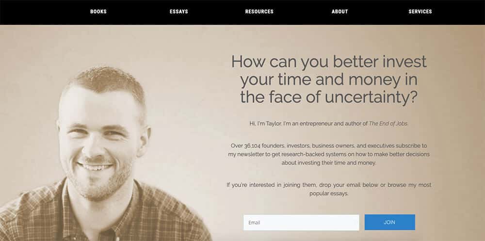
Taylor Pearson is an author, essayist, and entrepreneur. I first discovered him through his book The End of Jobs, which offers a provocative take on the future of work and the global economy.
Here’s what his homepage can teach you about writing website copy:
- Compelling question – The main goal of Taylor’s homepage is to get people to subscribe to his email list. To draw visitors in, he begins with the question, “How can you better invest your time and money in the face of uncertainty?” Since most people want to make better use of their time and money, this is an effective way to get people to subscribe.
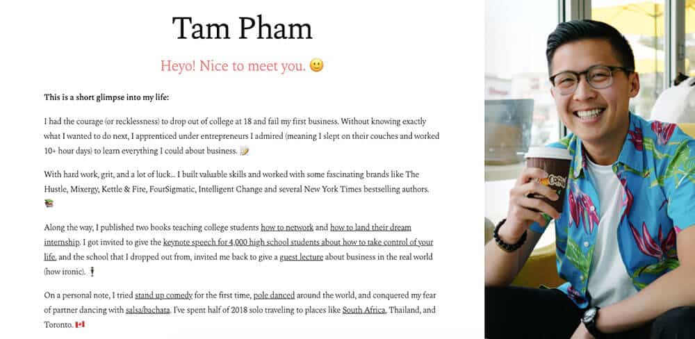
Tam Pham is many things, as his site shows. Here’s my biggest takeaway:
- Impactful use of emoji – Emoji immediately lend your site a casual, fun tone. As with exclamation points, however, using too many emoji can dilute their impact. Tam strategically uses emoji to emphasize certain aspects of his story without overwhelming the reader. If you’re looking to bring a similar feeling to your website, try a few well-placed emoji. (Here’s how to add emoji in WordPress, the platform we recommend for starting a blog).
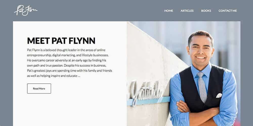
Pat Flynn is a podcaster, YouTuber, blogger, author, and entrepreneur. He’s best known for founding Smart Passive Income, a site that teaches people how to start their own online passive income businesses (while still remaining ethical and helpful). To learn more about Pat’s journey, check out Thomas’s interview with him in Episode 7 of the College Info Geek Podcast. Here’s what Pat’s site can teach you about copy:
- A compelling story – Pat includes a short blurb on this page of his site that draws readers in and invites them to learn more. Particularly compelling is the statement “He overcame career adversity at an early age by finding his own path and true passion”. If I didn’t already know Pat’s story, this would certainly make me want to read more to find out what this career adversity was and how exactly Pat overcame it.
Blog Examples
If you want to start a blog, you should go for it! No matter what field you want to pursue, writing regularly is a way to clarify your thoughts and show potential employers that you know how to communicate (an essential soft skill). The following are some of my favorite blog examples:
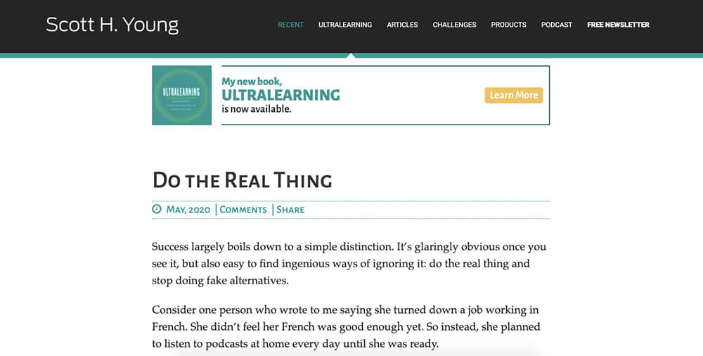
Scott Young’s blog covers all aspects of how to learn on your own. Whether it was completing MIT’s Computer Science curriculum in a year or spending a year speaking no English, Scott’s experiments are an inspiration to anyone who wants to learn things outside the classroom. Here’s what he can teach you about starting a blog:
- Document your experiments – You don’t have to be an expert to start a blog. Scott wasn’t a computer scientist when he started the MIT Challenge; in fact, the whole appeal of the series was that he had no prior knowledge of the subject. You don’t have to be as ambitious to apply the same principle to your blog. You could document fitness challenges, writing experiments, or anything where you can share progress and push your current abilities.
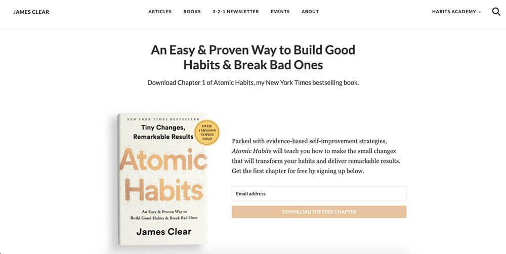
James Clear is a writer, speaker, and the author of Atomic Habits (one of the best books written on how to build good habits and change bad ones). Much of that book is built from the writing, research, and thinking he did on his blog. Here’s what his blog can teach you:
- A blend of storytelling and practical advice – In a typical post, James will start with an interesting anecdote such as how a cycling coach improved his team’s performance or how a fitness pioneer stayed in shape till the age of 96. From there, he’ll move to what these stories can teach us about building lifelong habits. This is a winning formula, with nearly endless possibility for new content (one of the common challenges of starting a blog is running out of things to write about).
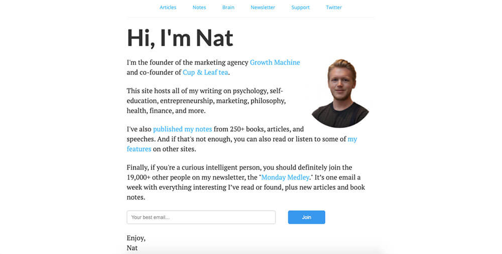
Nat Eliason has an excellent blog, as well as one of my favorite weekly email newsletters across the internet. He was a big inspiration to me to forego a traditional job, as well as showing me that you don’t have to have a main topic for your blog.
The main lesson aspiring bloggers can learn from his site is:
- Write about what interests you – Nat has written about everything from location arbitrage to how to open a cafe. And he continues to write about new things as his interests change. This is an inspiring personal blogging strategy, one I encourage you to adopt if you just want to start a blog to put down your thoughts without the goal of creating a business (which has a whole different set of considerations).
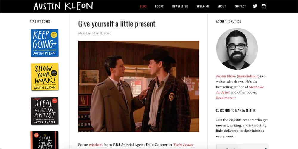
Austin Kleon is a self-described “writer who draws”. I turn to his books Steal Like an Artist, Show Your Work, and Keep Going whenever I’m in need of inspiration, and I’m also an avid follower of his daily blog. Here’s what he can teach aspiring bloggers:
- Show your work – Okay, so this is a rip-off of his book title, but the whole premise of Kleon’s site is to show his works in progress, sketches, and rough ideas. I love seeing him think through a problem over the course of weeks or months, of how his thinking evolves on issues related to art and life. You can do the same no matter what sort of work you do; use your blog as a place to showcase your progress.
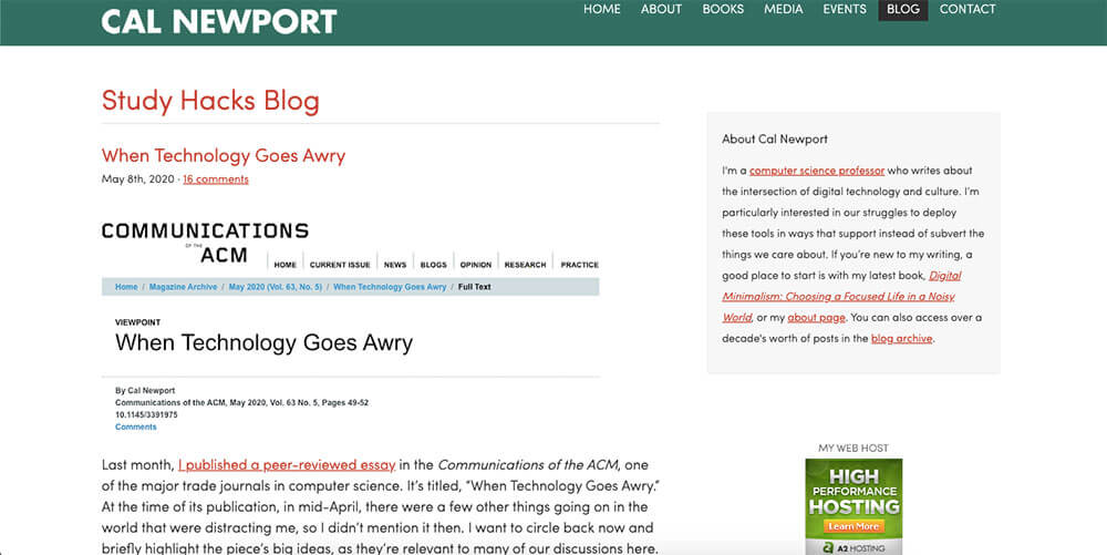
Cal Newport is an author, blogger, and computer science professor at Georgetown University. His book Deep Work is one of the most influential non-fiction books I’ve read, and his latest book Digital Minimalism is an intensely relevant read for our current time.
Furthermore, his books about college success were influential when Thomas was starting this site and remain on our reading list for students. He’s such an influence that Thomas interviewed him twice: first on Episode 35 of the College Info Geek Podcast and again on Episode 100. Thomas and Martin also recorded an episode discussing the key ideas of Digital Minimalism.
Here’s what Cal can teach you about blogging:
- Write less; say more – Many of Cal’s posts are quite short, sometimes just a few hundred words. Yet they’re consistently interesting and thoughtful. This shows that you don’t have to write long blog posts to have a valuable blog; a short, information-dense post can be more valuable than a long, bloated one.
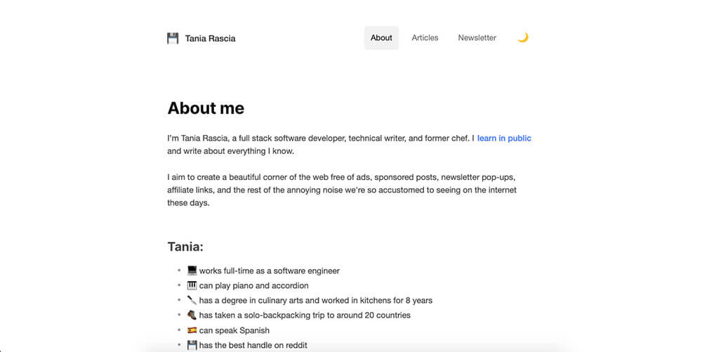
Tania Rascia is a software developer who writes some of the best programming tutorials I’ve read. Here’s what her blog can teach you about writing online:
- Editorial integrity and transparency – Tania is very clear that her site doesn’t have ads, affiliates, sponsored posts, or paywalls. She simply asks readers to enjoy her work and to consider supporting her on Ko-Fi, a site that helps creators get financial support from their audience. There’s nothing wrong with making money from your blog, but you should let your readers know how you do it and if it influences what you write about.
Portfolio Site Examples
To close out this post, I want to highlight a few of my favorite portfolio sites. The people featured are a diverse bunch of writers, designers, developers, and filmmakers, but all have sites that do an excellent job of showing off their work to potential clients or employers.
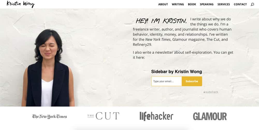
Kristin Wong is a personal finance writer, journalist, and author of the book Get Money. She’s also been a mentor to me in my writing and freelancing career; Thomas interviewed her back in Episode 27 of the College Info Geek Podcast. Here’s what you can learn from her site:
- Use media logos – Kristin has been featured in some pretty impressive places, including The New York Times. If you have any kind of press or media feature for something you’ve written or otherwise accomplished, using logos from the relevant media outlets (with permission, of course) can be an immediate boost to your credibility.
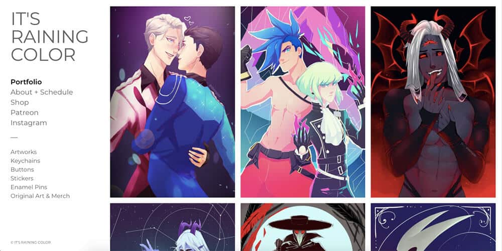
Anna Ellenberger is an artist who works under the name It’s Raining Color. In the past, she did the design for College Info Geek, and she continues to be a collaborator on the site. You can learn more about her journey as a graphic design student in Episode 32 of the College Info Geek Podcast. Here’s what we can learn from her site:
- Portfolio-first design – Since this is an art website, it makes sense to put the art front and center. That’s what Anna has done with It’s Raining Color, prominently featuring works that show off her style. This is a great approach to take if you’re building your own art portfolio.
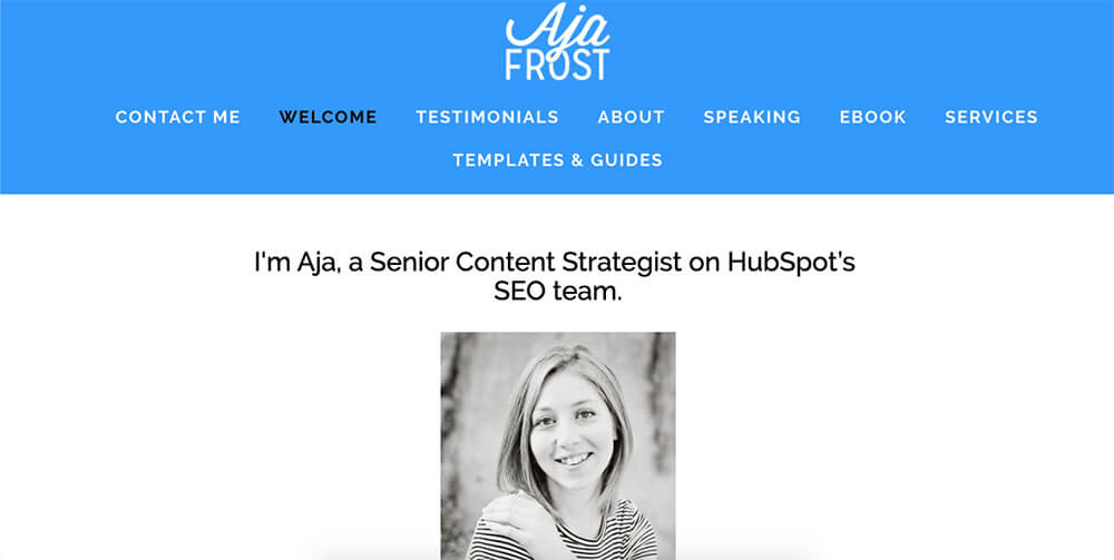
Aja Frost is a senior content strategist for HubSpot. She got started writing when she was still a student, earning enough to pay off her student loans and build a solid income stream even before she graduated. You can hear more about that story in Episode 97 of the College Info Geek Podcast.
Here’s what you can learn from her site:
- Classic, easy navigation – The top menu of the site has everything you need to find and see more of Aja’s work. We’ve seen a lot of fancy layouts in this post for showcasing work, but there’s nothing wrong with keeping it simple; some designs are classic for a reason.
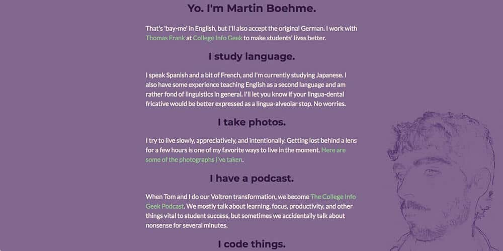
Martin Boehme is in charge of all things code and development here at College Info Geek. He also co-hosts the College Info Geek Podcast and spends his free time learning languages and taking photos. Here’s what his site can teach you:
- One-page portfolio design – In just one concise page, Martin lists all his interests and accomplishments. There are links if you want to learn/see more about each of them, but on the main page he keeps things simple, with each heading written as a sentence for easy skimming. You can do the same when you want to show off your work and interests.
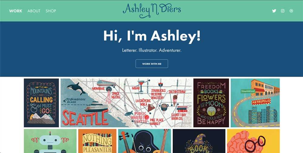
Ashley Diers handles all things graphic design and illustration here at College Info Geek, as well as running an Etsy shop where she sells prints, stickers, and postcards of her original illustrations. Here’s what you can learn from her site:
- Images are compelling – In Ashley’s case, the best way for her to showcase her work is to put the images right on the front page. This wouldn’t be the right strategy for everyone. But even if the work you do is less visual, you can still use images as a way to draw people in to see more of your projects.
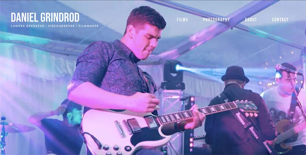
Daniel Grindrod is a camera operator, videographer, and filmmaker. His website showcases this immediately. Here’s what his site can teach you about creating a portfolio:
- Highlight reel – The first thing visitors to his site see is an embedded video showcasing his most recent work. Incorporating video into your site is always a good move as long as it doesn’t slow down your page. But even if you don’t have video work to showcase, you could still have a video that shows off your different projects (though this can be easier to do for some types of work than others).
Start Creating Your Awesome Website Today!
If you’ve made it this far, then you must be really dedicated to creating a personal website. Thanks for reading; I hope this guide gave you some inspiration and direction, whether you’re building your first site or giving your current one a facelift. To learn more about how to create a personal website, have a look at our other guides:
- The Ultimate Guide To Building A Personal Website
- The Essential Components of a Great Personal Website
- The Complete, Step-By-Step Guide To Creating A Successful Blog
Happy website creation!
Image Credits: featured image


