So you’re looking to make yourself stand out from other students and be more attractive to recruiters. You know that having a personal website can help you do both.
Maybe you’ve already got yours built. Or maybe you’re still trying to figure out how to build one. Either way, you’ve still got another question running through your mind:
“What should I put on my personal website?”
In this article, I’ll answer that question. There are a lot of different components that can be included on your website, and here I’ll explain the benefits of each one. Once you’ve gone through them, you should have some great ideas of what to include on your own site.
But before we dive into specifics, I have to ask you:
What are your goals?
What are you trying to accomplish with your personal website? Design is easier when you begin with a goal in mind (heck, almost everything is, for that matter). Bearing that in mind, you should take some time to figure out what you want your website to do for you.
Take my personal website, for example. Here’s a look:
My website has very little content. It’s a single page, featuring just a picture of me, a few sentences about what I do, and a few ways to connect with me. That’s it.
I designed my website this way because the majority of the work I want people to see is right here on College Info Geek. My main goal is to brand myself as a college expert, and everything that will help me accomplish that goal is right here on this blog.
Because of that, there’s no reason for me to have much else over on my personal site. Extra content would just pull focus away from the link to CIG, which goes against my goals.
It doesn’t matter that I have design and web development work I could show off, a nice resume with lots of awards and job experience, or a LinkedIn profile I could link to. None of those contribute to my current goal of getting eyeballs on CIG and associating myself with it.
When I was still in college, my goals were different. CIG wasn’t my full-time business until the latter half of my senior year, and until then I still planned on trying to find a job after graduation.
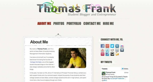
That’s why the previous version of my site featured a lot more content. Here’s what it looked like back then:
Since my goal was to find a job, I wanted to show off my skills and previous experience to employers. I included my resume on my site, along with portfolios for both my web design work and my writing. A Press page showed off the articles I’d been featured in, lending me credibility.
I wrote up a “Hire Me” page to advertise freelance services (to make some extra cash in between classes), which also reinforced which skills I had.
I also included pages to highlight my travels and the books I read, because I wanted to stand out – who knows what hiring manager is going to have his interest piqued because I traveled to Japan or read Astonishing X-Men?
As an aside, I’ll say that doing this definitely paid off. As early as the end of my sophomore year, I started receiving calls from recruiters and headhunters looking to fill full-time positions who had found my website. I always politely turned them down since I was still in school, but it certainly felt good knowing my website was out there working for me.
So before I show you some specific sections you can include on your website, I want you to think about your goals. Write them down, and then think about which components would best serve them after you finish reading this article.
Components of a Personal Website
Now I’m going to show you a list of components that would all work well on a personal website (depending on your goals, of course).
I’ve also included an example after each one from someone who’s website I think shows it off well. Feel free to check out each person’s whole site if you’d like to get even more inspiration.
About Me
Writing about yourself can be hard, but it’s essential to communicate who you are and what you do to people checking out your site. Include things like:
- What you do
- Where you’re going to school and what you’re majoring in (if you’re still a student)
- Who you work with (if you work with/for someone)
- What you’re passionate about
You can make this type of section as long or short as you want. You can also opt to make it your home page, rather than a separate page. However, if you go this route, I’d suggest keeping it short and to the point. People just hitting your site don’t have time to read six paragraphs detailing every year of college you’ve been through.
Sam Kapila, a designer I met at FU Weekend in Austin this year, created a great example of an About Me section. It’s simple, gets to the point, and it’s beautiful.

Contact/Social Media Info
Having some sort of contact information on your website is essential. After all, isn’t the point of your website to help you get connected with other people?
Keep it on your terms – you certainly don’t have to include your phone number (or even your email address) if you don’t want. You can easily use a contact form plugin, or a theme that has a contact form, to give visitors an easy way to get in touch.
Your site should be the “central hub” of your online life, so it’s a good idea to link out to the social networking profiles you’d like people to see (and don’t forget to link those social profiles back to your site while you’re at it).
Joe Kaziukenas, and entrepreneur whose website I really like, does this well. His simple site links neatly to his Twitter, Flickr, LinkedIn, and give visitors a way to email him.

Skills
If you have skills that warrant more explanation than a single word, it might be a good idea to give them their own section.
This is applicable for people like programmers, who might know multiple languages, frameworks, and tools. Designers might fit the bill here, too. They might do lots of different kinds of work – publication design, posters, interface design, etc.
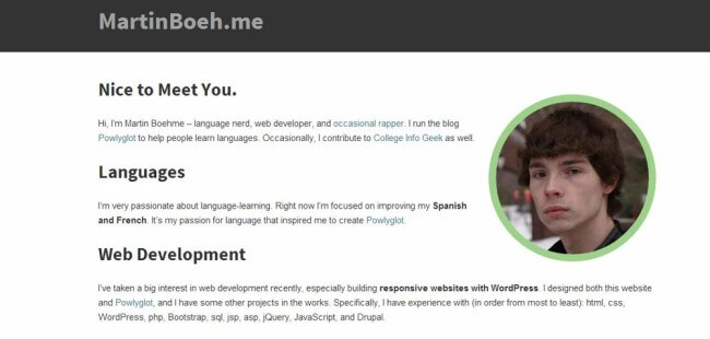
My friend Martin Boehme – who did all the coding on the CIG redesign, by the way – does a good job of this. His simple website describes his language skills and his web development skills, showing viewers the specific areas he’s got experience in.
Portfolio
Increasingly (and this is much more prevalent in small companies), hiring managers are looking to the specific work a candidate has done when making a decision – and resumes are mattering less and less.
That’s why you need a portfolio if you do any kind of work that you can show off. Giving people examples of your past work can make you stand out amongst other students who just list past job duties and classes they’ve taken.
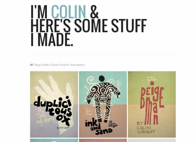
Colin Wright, a dude I’ve admired since I first started blogging, has a fantastic portfolio. In fact, he’s made it the main focus of his site.
Case Studies
This takes the portfolio concept one step further. Instead of only showing off finished projects, why not include some case studies to illustrate the process you took to accomplish something?
My design major friends are always complaining about having to turn in process notebooks along with their projects, but there’s a good reason for it. Their professors want to see the progression of their work. They want to see how their students think, and how they execute the concepts they’ve been taught.
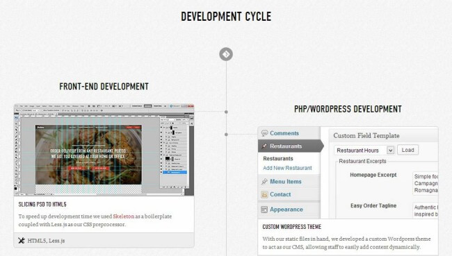
Michael Ngo, who was the focus of my post on being specific, has done a fantastic job of showing off case studies on his site. His latest project shows off the entire development process, from research and strategy all the way to the actual coding.
Resume
While I did say that resumes are becoming less and less important over time, you still need one. Heck, one of your classes probably forced you to write one, or will in the future.
The fact is that most jobs will still require a resume in order for you to apply for them, and a lot of hiring managers will still want to see one.
Including your resume on your site makes it easy for a visiting recruiter to get a look at your education, experience, and activities at a glance. You can either list the whole thing out, or simply link to the Word Doc in your Dropbox (having it there lets you update it easily, without having to re-upload it to your site).
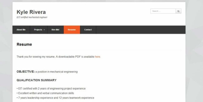
Kyle Rivera, a CIG reader who built his website using the personal website guide, has integrated his resume perfectly.
A Company-Specific Page
If you really want to work for a specific company, why not make a page on your website to woo them? Show that you know their business, why you would be helpful to them, and maybe even suggest some things you could do for them. I honestly don’t know why more people don’t do this.
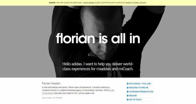
Florian Holstein actually made an entire website – Florian is All In – to express his desire to work for Adidas. He showed off his skills, gave a list of reasons why they should hire him, and pointed out things he’d like to work on.
The link above goes to a Web Archive version of Florian’s site. Since it’s been well over 10 years since he made it, he’s understandably let the domain expire. Someone else has turned it into a malware site, so I don’t recommend going to the actual, non-archived domain now.
He got the job.
I don’t really think I need to say much else.
Blog
If you want to establish yourself as an expert in your field, having a blog on your personal site is definitely a good idea. With a blog, you can illustrate what you’re learning, teach others, and create content that shows you know your stuff.
I’ve already written about other reasons why you should definitely have a blog, so you can go read them if you like. Luckily, adding one to your personal website is really easy (it’s explained in the guide).
You can also separate your blog from your personal site if you’d like to give it a different name. That’s actually what I did with College Info Geek!
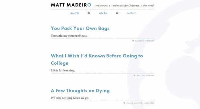
My friend Matt Madiero has done a great job integrating a blog into his site. Check it out:
Praise
What other people say about you often holds a lot more weight than what you say about yourself. When people vouch for you, you gain a lot more credibility.
For that reason, it’s great to add any praise, testimonials, and recommendations you have to your personal site. If these are public already (like on LinkedIn), then feel free to add them; if they were written for specific occasions, I’d recommend asking the person who wrote it before displaying it on your website.
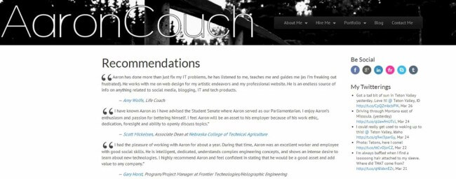
My friend Aaron Couch has done a great job showing off praise on his site:
Other Ideas
I’m not going to flesh these out, but here are a few other ideas for sections you could include on your site:
- Press Mentions – if you’ve been interviewed, featured, or mentioned in any press, listing it is a great way to build credibility. I do this here.
- A “Hire Me” Page – if you offer freelance services, this is a great type of page to have. You can explain what services you offer, your pricing, and direct people to your contact page to get the ball rolling on projects.
- Travel – As I discussed with Travis Sherry on the CIG podcast, travel provides you with experiences, stories, and added perspective that can make you interesting and more attractive to employers.
- Books You’ve Read – Showing that you’re a knowledge-hungry person who augments their education is always a good thing, unless a dictator is interviewing you for the position of Dumb Guard. You can use a Goodreads or Shelfari widget to show off what you’ve read.
Take Action
If you’ve been sitting on a largely empty personal website until now because you didn’t know what to put on it, now’s the time to start updating it. Put it to work for you.
Don’t have your own website yet? Check out my guide on building a personal website – it’ll walk you through the whole process. If you need some more inspiration, we’ve also put together a collection of 50 of the best personal websites we’ve come across.
Lastly, I’m very aware that it’s hard to write about yourself. It can be really difficult to figure out just how to put into words what you do, what your passions are, and how you can help others.
In the near future, I’ll be publishing another article that’ll tackle this problem. Trust me, I had a hard time writing about myself as well – but I was able to find ways to do it. If you want to be notified when it drops, check out the box below and get on the CIG newsletter!


